Great training provider websites have a lot in common - they're easy to navigate, they communicate what they offer clearly and succinctly, they're accessible, and it's easy for learners to find and book a spot on their courses.
But knowing the key features and seeing great sites are two different things. That's why we've selected thirteen fantastic training website examples to give you some inspiration that you can use if you’re designing a new training website, or looking at ways to improve your current website.
Let's get started.
1. Myopain Seminars
What we love:
- Bold value proposition
- Most popular course is effectively promoted
- Clear course layout
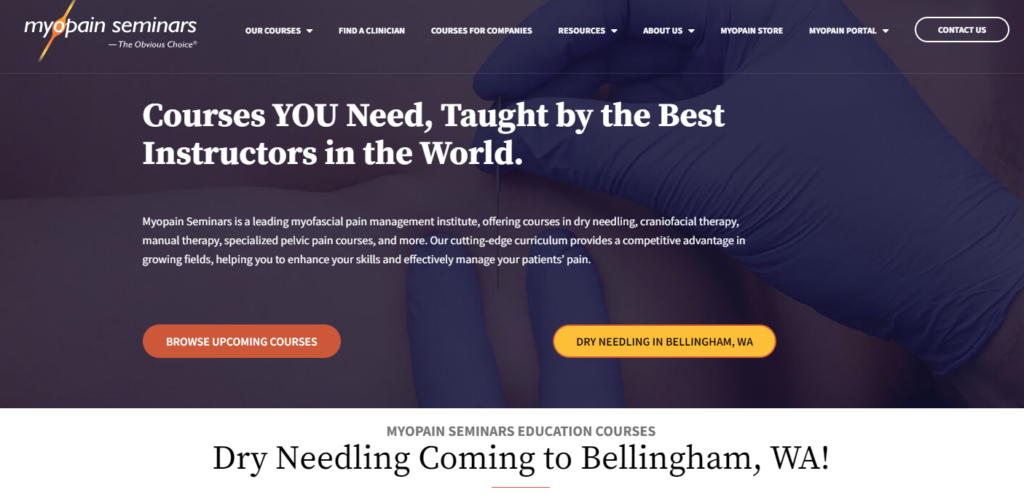
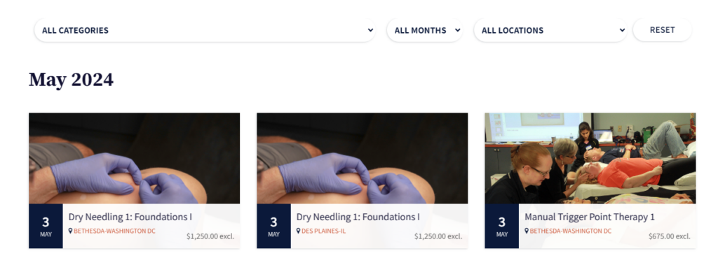
Myopain Seminars is a leading institute specializing in myofascial pain management, offering courses in dry needling, craniofacial therapy, manual therapy, specialized pelvic pain courses, and more. Their website excels at guiding users from the homepage to booking in a few simple steps. Users can click 'Browse Upcoming Courses', hover over a selected course, and register within just a few clicks.
The training provider offers a wide range of courses, making it easy for users to filter through different types. Their latest course, 'Dry Needling', is prominently featured alongside the 'Browse Upcoming Courses', option.
This design allows the provider to highlight specific courses while still catering to users who may not be interested in the promoted course but want to see what else is available.
2. Legalwise Seminars
What we love:
- Eye catching color scheme
- Promoted discounts
- Smart audience segmentation

Legalwise Seminars is an Australian leader in providing high-quality, legally related continuing professional development. This value proposition is clearly communicated in the hero section of their homepage, making it easy for users to navigate to their desired area of the website. The two primary sections accessible from the top navigation are "CPD for Lawyers" and "Law for Non-Lawyers."
Scrolling further down the homepage, a user can choose to view the entire upcoming course schedule or download a guide that showcases the upcoming webinars for the next few months. Visually, the use of blue tones across the site aligns with the legal industry's traditional color, promoting a sense of trust and reliability.

To encourage users to sign up for a training session they are interested in today rather than later, Legalwise has a discount banner that draws the eye. The discount offering is placed in a way that is neither overwhelming nor intrusive, and by stating that the offer expires on May 10, 2024, they subtly nudge visitors to register before then to secure the discount.
3. Frank Capability
What we love:
- Clean design
- Easy to navigate
- Clear value proposition
Frank Capability is a New Zealand-based training organization that offers a variety of courses aimed at improving the abilities of policy professionals to enhance their decision-making skills within the context of public policy.
Their website features a pleasing design and layout that makes it easy for users to understand what they do and obtain more information about their courses.
As you can see below, their homepage outlines their mission statement, while their course overview page provides a clear description of how their courses aim to help professionals. Further down on their course page, there is an easy-to-follow overview of their upcoming courses.


Their course overview page provides the name of each course, a short summary of what each individual course entails, its duration, price, and a clear button to learn more about the course. The page is also supported underneath by customer testimonials that advocate for the courses.


4. Pacific Art League
What we love:
- Header image that helps potential customers understand what the company offers
- Clear, easy-to-read value proposition/headline
- Eye catching color scheme
The Pacific Art League is a non-profit, public benefit organization located in Palo Alto, California. It offers a range of art education programs, high-quality exhibits, and community outreach opportunities. Their website features a simple, easy-to-navigate layout, with clear categories such as "Classes," "Exhibits," "Membership," and more in the top navigation to help users find relevant information efficiently.
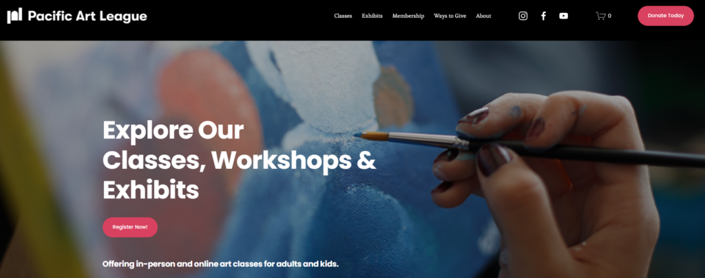
Each course category overview description provides an easy-to-read summary of what the courses/classes in the category entail. When a user clicks into one of the categories, they can easily see what classes are upcoming and filter based on timeframe, class topic, and teacher.
The use of attractive and engaging visuals reflects the artistic courses offered, while clear call-to-action buttons (CTA buttons) simplify navigation, making it easy for users to learn more about courses of interest and secure their places.


5. Dynamics 365 Courses
What we love:
- Clear value proposition
- Easy navigation
- Popular courses are promoted
Dynamics 365 Courses is a specialized training provider focused on Microsoft Business Applications. The company offers a wide range of courses, including those on Dynamics 365, Power Platform, and Power BI, catering to various roles from end-users to professional developers.

As soon as users land on the homepage, they can clearly understand what the training provider offers. From the homepage, they have multiple options: they can click on the courses button in the top navigation, which then reveals a full overview of the courses offered (shown in the third image), view a panel that showcases the full course schedule, popular courses, courses that are on sale, and more.

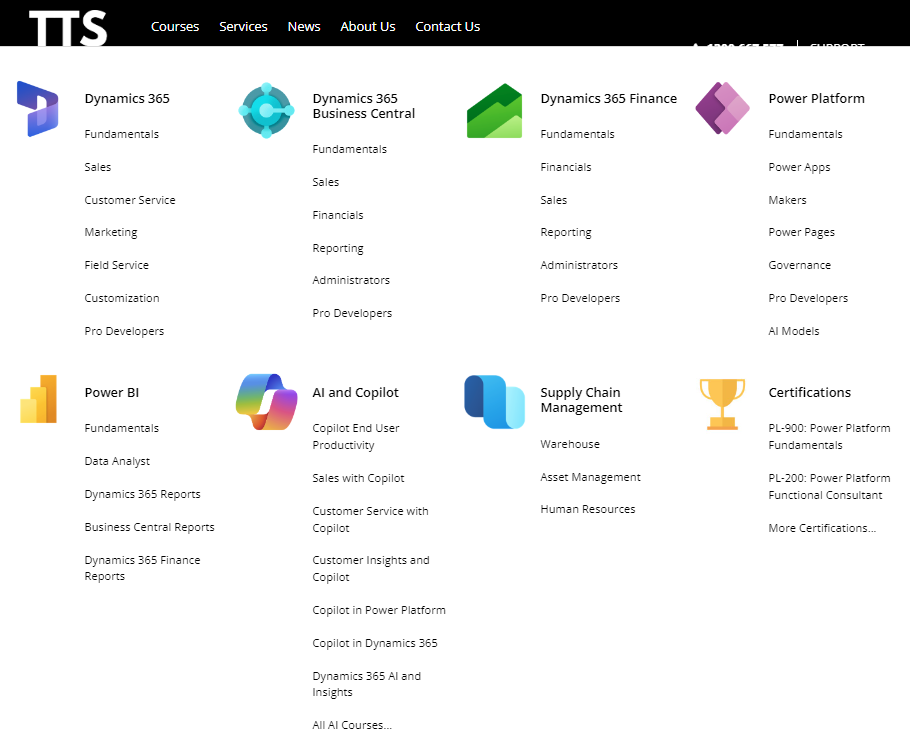
From the course overview, a user can click into an individual course or a course category such as 'Dynamics 365'. When a user clicks into a course category, they can easily see the upcoming courses, what each course entails, its duration, and price, and can click through to the individual course page. It is also convenient for users to switch to courses on another subject if they wish.

6. ITSM Hub
What we love:
- Clear value proposition
- Smart audience segmentation
- Easy navigation
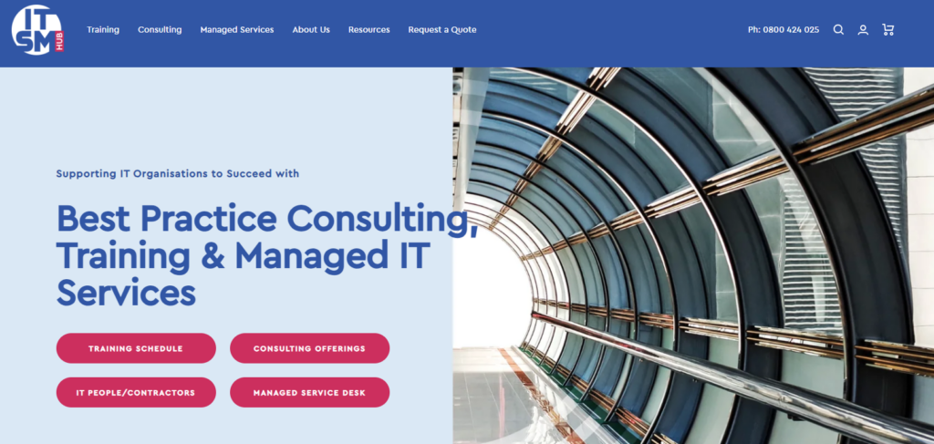
ITSM Hub, boasting over 25 years of experience in the IT Service Management market, offers a variety of courses and services to IT organizations and professionals. This value proposition is prominently displayed to anyone who visits their website.
From there, visitors can easily navigate to different sections of the website. If you scroll further down the homepage, you can filter through popular course options, and clicking on the 'Explore Courses' button leads you to a course overview page where you can select an individual course for more information or to register.
The combination of clear messaging, a visually appealing layout, and straightforward navigation allows users to quickly obtain the information they need, understand the provider's value, and securely book their space on a course—all within a few clicks.


7. Carey Centre for Lifelong Learning
What we love:
- Fast loading times
- Great visuals
- Clean navigation
The Carey Centre for Lifelong Learning is a charitable organization that supports and resources the ongoing professional development of both leaders and practitioners in ministry and mission.
Like other examples we've looked at so far, their website contains many of the elements of a successful training website. It’s immediately clear to users what the provider offers from the moment they land on the homepage, and navigation to their webinars/courses is straightforward.
After clicking the 'Webinars/Courses' button, users can easily navigate through the upcoming courses, select one they're interested in, and book a course. The website is quick to load, mobile-friendly, and does a great job of making it easy for users to get the information they need and sign up for a course.


8. St John First Aid Training
What we love:
- Clear value proposition
- Appropriate visuals corresponding with their course offerings
- Detailed course information
- In-person and online training offered
St John is a New Zealand-based charitable organization that provides a range of services, including emergency ambulance services, first aid training, and community health programs. Their training website combines practical design with effective communication to make it easy for users interested in their first aid courses to get more information and book their place.
Their site is structured to guide users smoothly from the initial course listings to specific course details and booking options. Each course page is detailed, providing essential information about course content, duration, and cost, and facilitates easy enrollment with clear call-to-action buttons.
The copy on the homepage clearly outlines what St John offers, allowing users to go from interested to booking their place in just a few clicks.


9. Victorian Deaf Education Institute
What we love:
- Easy navigation
- Clear value proposition
The Victorian Deaf Education Institute (VDEI) is part of the Victoria Department of Education and aims to improve educational outcomes for the 4,000 students in Victoria who are deaf or hard of hearing. To achieve this, VDEI collaborates with schools, early childhood programs, universities, and other professional organizations.
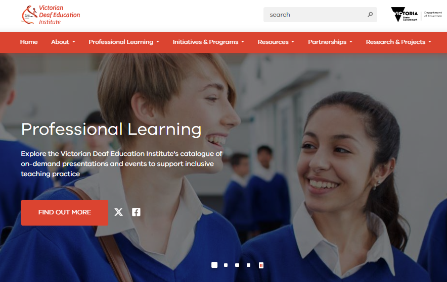
Their website features an easy-to-use layout that provides a welcoming first impression. The header copy beneath the headline clearly outlines what the institute offers and the training provided.
Clicking the 'Find Out More' call-to-action leads users to an overview of VDEI's training catalog, where they can explore general information about course content, duration, and cost, before diving into more detailed descriptions of each course, including in-depth overviews, learning outcomes, presenter details, and registration opportunities.

10. British Weightlifting
What we love:
- Great audience segmentation
- Striking visuals
- Rich course information
British Weightlifting is the UK's recognized governing body for weightlifting and para powerlifting, whose mission is to inspire a nation of lifters through exceptional leadership and expertise. Their website is a great example of how training providers can set up their website to capture interest if they offer more than just training. British Weightlifting offers memberships to affiliated clubs, training programs, and information on different national competitions.

When a user navigates to the training section of the website through the 'Learn' button on the homepage or the 'Find a Course' in the top navigation, they can easily view what courses are offered and navigate to their chosen course category.

When a category is selected, a user can then read information about the course and sign up for their preferred choice of a practical or online course. The website is clean, easy to navigate, accessible, and delivers essential information to users very practically.


11. Big Nerd Ranch
What we love:
- Clear value proposition outlining the training they offer
- Rich course information
- Effective registration process to ensure learners only sign up for courses they are suited to
Big Nerd Ranch is a web & mobile app development agency that offers expert training and services, with their training centered on leveling up new hires or an organization's existing team. When a user lands on their site, they can quickly decipher what Big Nerd Ranch offers and navigate to the training area of their website. The training section is transparently named so it is clear whom the company serves with their training.

When a user navigates to the corporate training overview page, they will find information about what makes Big Nerd Ranch stand out, why it is the company they should choose, and information on the types of training and individual courses they offer.

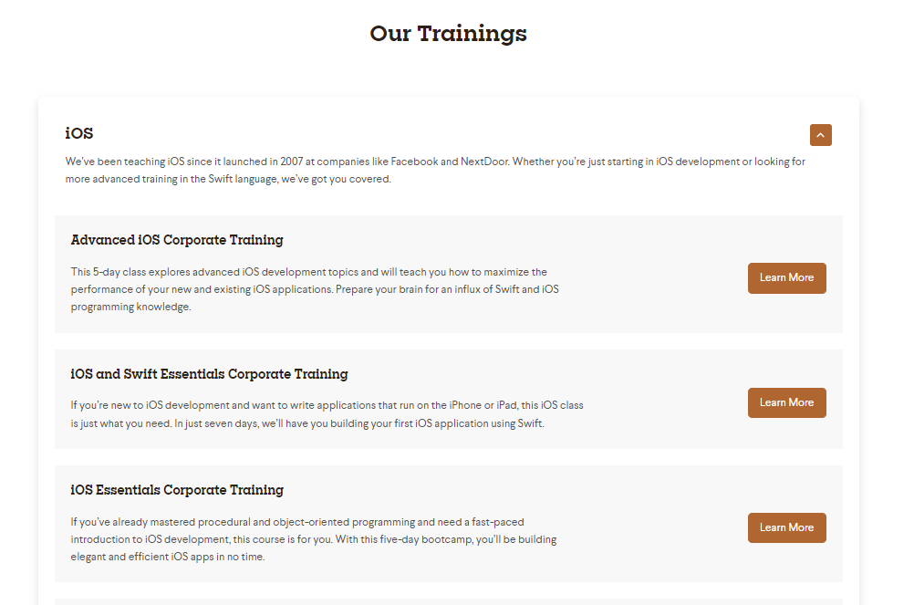
On the individual course page, users can get all the information they need about the course. Interestingly, however, they cannot book their spot straight away. This is intentional. As the company offers specialist courses, it is important that learners have the required aptitude to carry out the course. Therefore, they need to speak to a member of the Big Nerd Ranch team to ensure they are a good fit for their chosen course.

12. Stay Upright
What we love:
- Clear navigation that allows users to quickly find courses in their location
- Effective SEO practices in place
- Great visuals
Stay Upright is an Australian motorcycle school that aims to enhance the skills of every rider through its motorcycle training courses. The website is designed to be straightforward yet effective, allowing users to quickly discover courses offered in their state, which saves time.
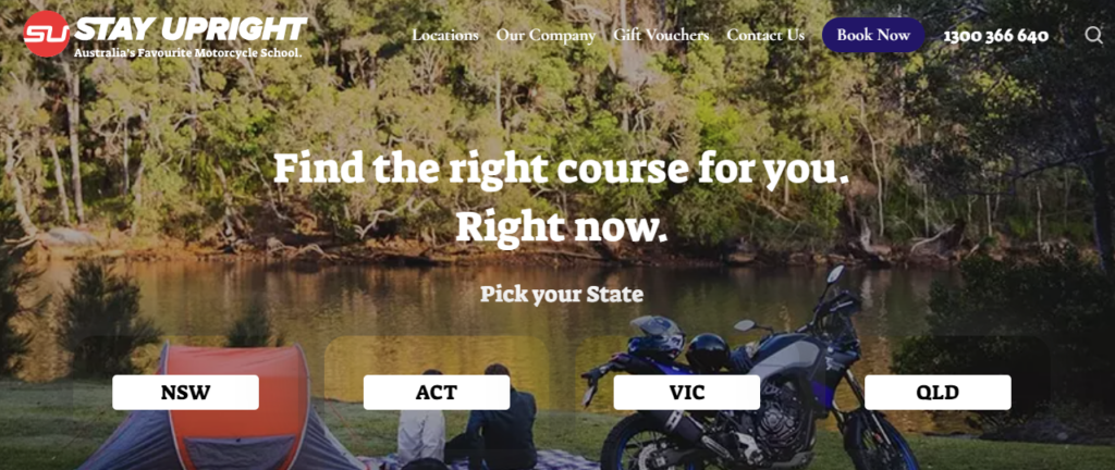
Once a user selects a state, they can further refine their search by clicking on an option that best suits their needs, leading them to relevant information about the individual course. Stay Upright also excels at informing users about the requirements for obtaining their motorcycle license without directing them to another page. This helps to reduce the bounce rate and keeps users close to the point of purchase while providing valuable information.

From a search engine perspective, providing this information directly on the page will help it rank well in search engines, particularly for terms like ‘How do I get my motorcycle license in Victoria?’ This helps bring relevant organic traffic to the site.

13. SoftEd
What we love:
- Descriptive call-to-actions
- Easy navigation
- Clever audience segmentation
SoftEd is a global training provider specializing in agile methodologies, business analysis, and software development. They offer a wide range of courses designed to upskill individuals and teams within organizations.
Their homepage effectively segments visitors based on their goals. The first button guides managers and leaders within an organization to relevant information and outlines the options the provider offers to help upskill their team. The second button is for individuals, guiding them to a page that provides information on the different career areas for which SoftEd offers courses.
The SoftEd website is an excellent example of how training providers can set up their websites to cater to different types of learners by offering structured pathways on their homepage, without diluting their overall value proposition.


What do great training websites all have in common?
As you can probably tell, there are a few commonalities that all of these training websites have in common, mainly:
- Visitors can easily find the courses the provider offers.
- Visitors can become customers within a few clicks
- It’s clear to users within a few seconds of landing on the website what the provider offers
- A straightforward checkout process.
Here’s a more in-depth look at them:
Visitors can quickly find courses
Great training providers don't make visitors click around on different areas of their website to find their courses. Many training providers will have a "Browse Upcoming Courses" call-to-action button on the hero section of their homepage, or a "Courses" or some variation, button in their top navigation.
(P.S You can learn how a great training website integrates with training management software, in our ultimate guide to training management systems)
Visitors can become a customer within a few clicks
One thing you'll notice with all of the websites we've looked at is that they make it very easy for a visitor entering the site to sign up for a course. The successful click flow that these websites capture typically looks like this: Homepage → CTA to view courses within the header of the homepage → CTA leads to a course overview page → Visitor can then click on the individual course leading to a landing page → Visitor can request more information or sign up. Importantly, the visitor can complete this sign-up process in 5 steps or less.
Visitors can quickly understand what the training provider offers
The best training websites communicate the types of courses and training they offer, don't waste time with convoluted explanations, and effectively tell their brand's story. This can be as simple as having a mission statement/USP on the header of their homepage, or having more in-depth company overview section that's easy to navigate to.
They offer a frictionless checkout experience
More visitors will turn into course sign-ups if your checkout experience is straightforward. There are many checkout best practices you should follow, including not having too many fields in the form, autofill enabled to remember visitor details, offering multiple payment options to accommodate different preferences, and provide a clear summary of the course costs and fees before the final submission.
Ready to improve your training provider website? We can help!
Now that you’ve seen some great design ideas and examples of awesome training websites you can go ahead and make sure your website contains ticks the same boxes or you can utilize Arlo’s pre-built website templates – designed specifically for training providers!
Our designers and developers have created a comprehensive library of ready-to-use page templates that can be easily integrated into your website. Every template has been crafted to encompass many of the training website design best practices we’ve discussed in this blog, and many more that we’ve drawn from our years of experience building and optimizing hundreds of training provider websites.
Arlo’s Professional Services team can work with you to get your website up and running, with custom solutions and packages designed to cater to your business, expertise, and budget. To find out more, book a free consultation.


.png)
.png)


