


As corporate professional development budgets continue to rise, competition amongst training companies for a slice of this PD pie has hit an all-time high. Creating a kick-ass training provider website means cutting through this noise and making your customers’ life easier, from first visit to purchase.
At Arlo, we’re experts in creating seamless web experiences for training providers. Our team has successfully managed hundred of personalized web integrations for training organizations – and we’ve learned a few tips and tricks along the way.
This guide outlines a curated list of actionable tips to supercharge any training provider website. Most of the tips should be easy to implement on a generic content management like WordPress or Drupal, and all should be baked into a purpose-built training management system like Arlo.
Chapter 1: The best training provider websites put user experience first.
You don’t get a second chance at making a first impression, so how easy is it for people to find what they are looking for on your website? From visit to conversion, transform your training provider website into a user-friendly experience with these three tips:
79% of people who visit your website and can’t find what they’re looking for within the first few minutes will give up and return to Google.
Think with Google
Get users from your homepage to training catalogue, FAST
Speed is of the essence — the faster users can find a relevant course or training program, the more likely they are to purchase. Make it easy for people to navigate around your website by positioning a catalogue gateway on your homepage.
Safety ’N Action have hit the nail on the head with the below homepage widget. Clearly displayed on their homepage, users can discover courses relevant to them via a search box and filter functions. Alternatively, if visitors aren’t sure what they’re looking for, they can browse the full range of courses and training programs by clicking on a direct link to the course catalogue. It’s clear, simple and in prime website real estate: right at the top of their homepage.

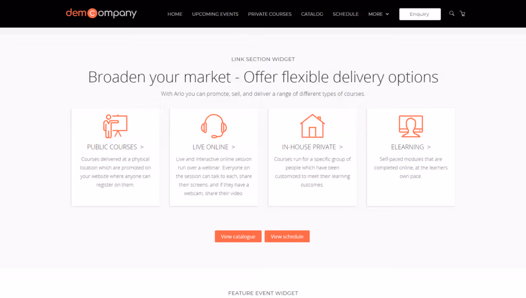
Similar to the Safety N’ Action example above, the topic-based ‘promote your courses’ widget below gives users multiple entry points into this training company’s catalogue gateway. Not only does it clearly outline the breadth of training topics they offer, it also helps users drill a layer deep into the website’s training catalogue.
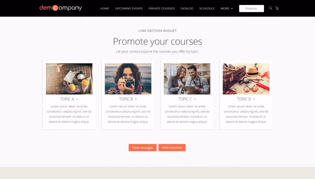
Advertising your products’ delivery method on your homepage is another useful way to invite website visitors to engage with your courses. It helps users personalize their experience of your website — for example, if someone is based in a remote location, they can choose to only look at courses that are available online.
Use filters and search functions to help users drill deep into your website’s training catalogue
Sifting through pages of irrelevant information is never fun — don’t give your users an excuse to abandon your website before they’ve even scratched the surface. Sort your courses into logical categories; this will help potential customers progress further along their purchasing journey. As described above, three clear filters that can help your users drill into your training catalogue are:
- Course topic
- Delivery method
- Location
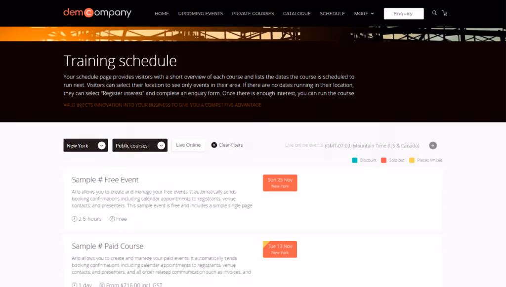
Alongside the sorting features on your homepage, it’s also important to build topic, delivery and location filters into your course schedule catalogue too. This allows users to scan filtered high-level information without having to drill into every individual course description page.
Course searches allow you to nudge your potential customers closer to the checkout point. If a user has committed to manually typing what they’re looking for, it’s safe to assume they’re further down the conversion funnel than your average website visitor. This type of person already knows what they want — the next step is providing them with rich data to help them make an informed decision.
For example, in our training provider website solution, we’ve created a search result page that displays this rich data. Above and beyond a simple list of page names, you can see this search also produces results that detail when courses are running, their location and the category they fall under. This helps users gain quick, informative overviews of their course searches without having to navigate away from the results page. Furthermore, the categories shown in green text are clickable, so users can explore and discover more results under the topic tags.

Reduce friction in your checkout
What percentage of your website visitors start the checkout process but don’t complete it?
We’ve highlighted the crucial role that first impressions play in capturing your target audience’s attention, but how your visitors interact with your checkout page is the real make-or-break moment when it comes to running a training provider e-commerce website. A complicated checkout process is a big turn-off for potential customers. Focus on streamlining your checkout process by following these simple steps:
- Remember visitors’ details – Autofill gives users the option to populate their checkout form with the details of the last registrant, or registrants that have input data.
- Let them add a booking contact – The person placing the booking isn’t necessarily the registrant; give the visitor the option to add a booking contact. Both booking contact and registrant will then receive a copy of the invoice and order information.
- Allow for multiple registrants on the same course & multiple courses per order – People don’t want to go through the pain of checking-out multiple times. Keep it simple — one invoice, one order.
- Auto-apply discounts – Set up discounts that will be automatically applied at checkout based on specific criteria.
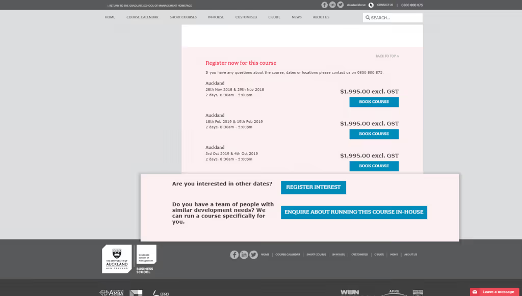
Below is an example of how you can build customizable course registration forms in Arlo to streamline your checkout process. The checkout steps are clearly displayed in stages above each form which helps the customer grasp the time required to complete the order, and also provides reassurance and continuity throughout the process.

We’ve used the autofill function to populate the attendee form with the last registrant’s details — in this case ‘Felicity Merrington’. Another way to speed up data entry whilst reducing human error is to offer a drop-down list of suggested organizations for the ‘Payer’ section of page two. This not only makes it quicker for the user, but also ensures your data is clean. Removing or reducing duplicates at the checkout stage is important if your system automatically integrates with your accounting system.
Chapter 2: Eliminate admin: connect your training provider website to your back-end systems
Do you manually manage your website content? Cut out this unnecessary chore by connecting your training management system (TMS) to your website back-end.
Making the change now will save you time and effort in the future, whilst also helping safeguard your content against human error. The benefits? Every time you make an edit on your TMS it will automatically be pulled through to your website, so your customers will always have access to the most up-to-date information. If a course gets canceled or becomes full, a waiting list will be switched on in real-time.
Let’s have a look at some common ways to connect your front-end and back-end web systems.
Really bad: nothing connected
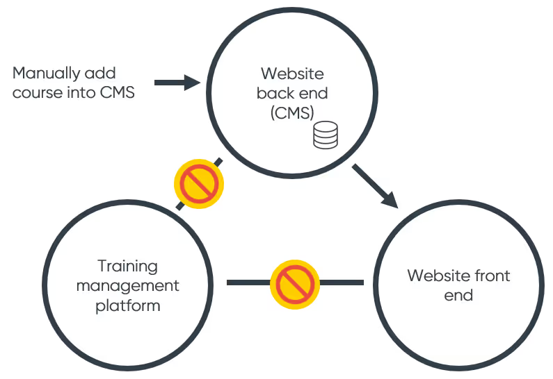
Most training operators we talk to have this model. They manually enter course information into their website back-end, which is then displayed on their website’s front-end for customers to see. Website registrations do not flow back into their training management system or Excel spreadsheets. Any changes to a course, like date, venue or full event, needs to be manually updated for the website. Ouch.
A bit better: courses but not registrations
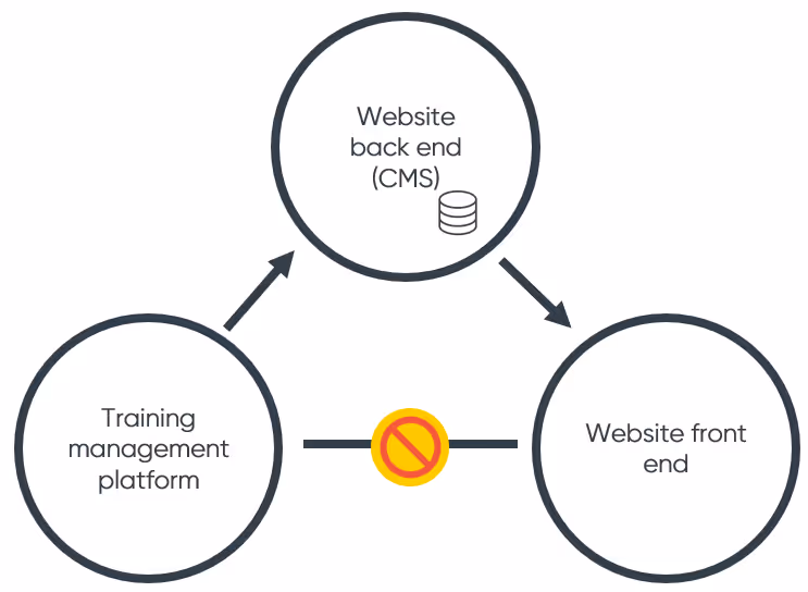
This is slightly better. The course information from the training management automatically flows into the website back-end. This creates a duplicate database in the CMS which is sync’d periodically. But registrations still do not flow through to the training management system, resulting in manual administration.
Pretty good: all three connected
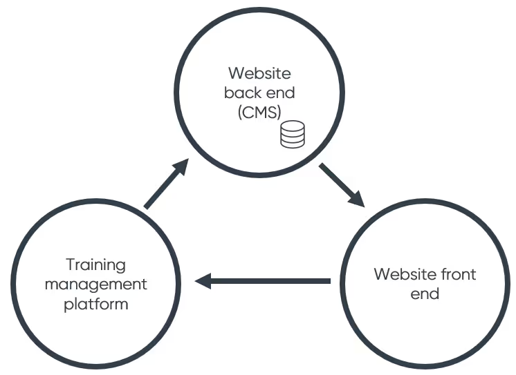
This scenario is fully automated, but has a couple of issues in practice. Firstly, website CMS data is not real-time as it only synchronizes with the training platform periodically, so you risk selling places in a course that are no longer available. It can be tricky to implement as you end up having to build a whole new training database in your website CMS.
Best: cut out the website CMS
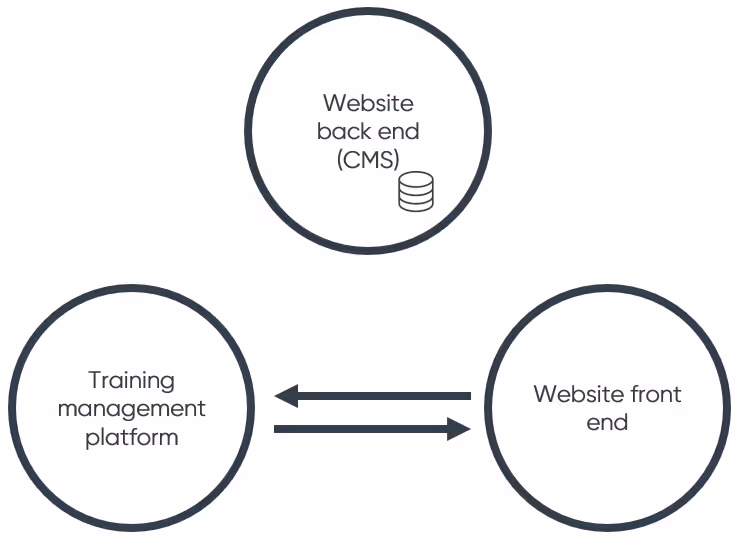
The modern solution is to take your website back-end out of the picture completely. Your website front-end connects live to your training database, so there is only one set of data. This is faster to implement and content updates in real time. Arlo’s web controls use this method.
xxx
Chapter 3: Create an excuse to capture leads on your training provider website
96% of users that come to your website are not ready to buy.
Do you collect data from people who are not ready to buy? The majority of users won’t convert to sales straight away, and that’s why it’s crucial to capture leads early on. All visitors are valuable, so explore multiple avenues when gathering emails and forming relationships. Email data also gives you the chance to check-in with visitors if they decide to abandon their checkout.
In return for personal data, emphasize a value exchange with your website visitors. People will be more willing to give you their email if they feel like they’re getting something worthwhile in return. Offer your visitors the option to:
- Save courses to favourites
- Access gated content
- Suggest a new course topic
- Subscribe to a newsletter
- Enquire to run a course in-house
- Request to run a course in a specific location
Chapter 4: Be seen when people go looking (SEO)
75% of users never scroll past the first Google page.
Is your website optimized so it appears listed on the first page of a Google search for training providers? Here are some suggestions on how to use SEO strategy to make sure your site is seen by the right people.
Use Google’s structured data mark-up
A first page ranking on Google doesn’t always translate to website click-throughs. The information in your listing needs to be clearly laid out so that people can judge, at a glance, whether your services will be of value to them.
Unfortunately, Google isn’t a mind reader — to avoid unhelpful snippets from your website being previewed as a description, you need to tell Google about your course pages:
“Hey Google, what you’re looking at on this page is a list of courses and each of those courses are run on a specific date, at a specific location”.
The good news is that Google has clearly outlined how they want to be told about event data. They call it, structured event data.
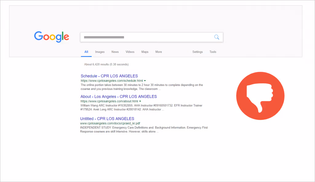
Here you can see a training provider website that has not been set up correctly for structured event data. Their pages just look like standard webpages in Google.
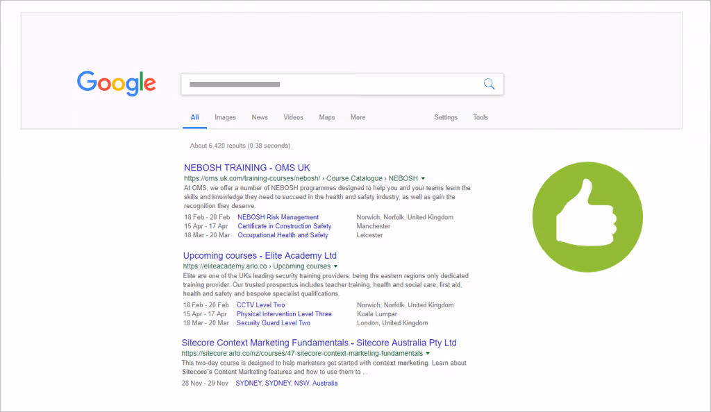
Here you can see how the search results display for some of Arlo’s customers. Behind the scenes, course dates, names and locations use this structured data mark-up so are given this hero treatment in Google. You can use this Google mark-up on any website using any content management system.
Align course names and descriptions with SEO keywords
Using keywords and phrases on your training company website increases the chance of your content being discovered via search engines.
Below we’ve included two examples of a Microsoft Excel course description to demonstrate best practice for keyword and key phrase usage. The first example wouldn’t rank high on a search due to missing out part of the key phrase — ‘Microsoft’. Although the majority of people automatically understand what ‘Excel’ alone stands for, this cannot be taken for granted when it comes to SEO.

Make sure your keywords align with your course names and descriptions because Google will always bring up pages that directly match key phrase searches versus those that only partially do. This highlights the importance of researching and reviewing the keywords you choose to use in your course titles and content.
Make your training provider website mobile-friendly
If your training website isn’t mobile-friendly, your Google rankings across the board will suffer. Google’s algorithm doesn’t discriminate — a desktop search will still be put below other, more mobile-responsive websites, regardless of the type of device used to make that search.
Providing a great mobile experience isn’t just about the ranking though. More people are using their phone to access your training website than on desktop or tablet. This browsing behaviour should ultimately inform how you build and update your training company website.
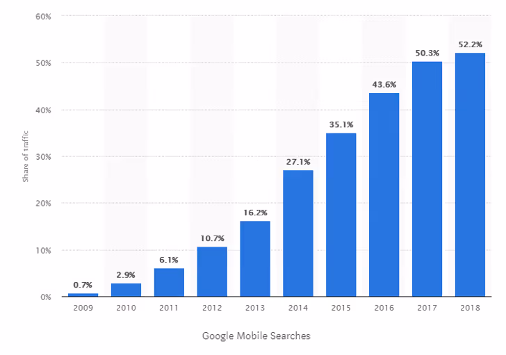
The progressive rise in mobile searches has also changed the way people purchase. Forbes reports that experts predict that mobile commerce sales will account for 62% of all retail sales by 2027. If your training e-commerce website isn’t mobile friendly, you’re not only missing out on Google rankings, but sales too.
Have you ever experienced the frustration of trying to use a text box that’s too small for your fingertip? Websites that fail to consider the needs of their mobile audiences can be tedious to use. Consider these two crucial points when designing platforms for mobile navigation:
- Smaller screen = Visitors have a limited view of your course catalogue which will make it harder to scan and compare course information; this is where your search function becomes essential. Design a search box that is visible and accessible so that your users can explore your catalogue with ease.
- Touchscreen navigation = Using a finger instead of a mouse cursor makes it harder to select small, specific CTA buttons. Clickable areas should take up more screen space on mobile devices so users can easily click and fill in details.
Are you ready to revamp your training provider website?
So, we’ve taken you through our ultimate guide to creating a kick-ass training website — now what? At Arlo we’re dedicated to building beautiful web experiences, from start to finish. All the pre-built pages and widgets featured in this guide are part of a comprehensive library of ready-to-use page templates that can be easily integrated into your existing website or used to start a new one.
The Arlo Professional Services team is ready to work with you to get your website up an running, or to integrate specific elements into your existing training website. To find out more, book a free consultation. Or check out the beautiful websites we’ve been able to create across the world!